Wednesday, 23 February 2011

Ok this is what its looking like so far


Well this is as far as I am going with the mock up. Hopefully I will be able to get my concept across with this. Stay tuned for further developments and fingers crossed the finished site is a mere 3 weeks away.

Tuesday, 22 February 2011

It just so happens


Another bit of research that I just so happened to come across. I was doing another bit of research for a part I am playing in A Midsummer Nights Dream at The Peoples Theatre in Newcastle. I am playing Oberon King of the Fairies but thats another story however. I bought a dvd of the 1996 production by the Royal Shakespeare Company and I noticed the menu of it was set up like a stage with characters coming on and off on strings and pulleys, this is exactly how I want my scenary to operate on my portfolio so I thought I would share it with you. As for me being a fairy well its not good for the street cred but its certainly an experience which hopefully my portfolio will turn out to be.

Lighting it Up

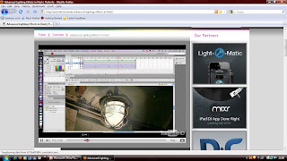
I have been doing this tutorial on lighting effects in
flash because I want my lights on my stage to look realistic with shadows and give a realistic look to whole site adding atmosphere. Obviously I want to use lighting effects for spotllights and scene changes also. This was a really useful tutorial and I have enjoyed doing it immensly take a look for yourself...

LINK TO TUTORIAL

More Peeping

Its amazing what you find when you have a peep. I forgot I already owned a small peep show already in an old childrens book so been having a look at that. Brings back so many memories The Jolly Christmas Postman by Janet and Allan Ahlberg illustrations are fantastic but the concept is even better.


Peep Show


No not the seedy kind or the TV comedy sketch show the original Peep Shows with cardboard cutouts that you look through. This is the sort of style I want to use for the sets on the stage. Found this book by Eugene F. Provenzo showing you how to make one out of a shoebox.

LINK TO EBOOK


I also found this website which tells you about the History of the Peep Show interesting read and also some nice examples to look at.


Yet more Templates

Another Flash template have found. I prefer the way this one looks to the last so I thought I would upload it to show you this style as I prefer it to the last one with the red curtains and the 3d floor giving you perspective the lone mike is a nice touch too just adds a bit of sophistication to it. Almost like the website is speaking to you.

LINK TO WEBSITE

Whats Available

I was doing some research on the internet for current theatre related websites and I came accross this site for some flash templates. I like some them especially the opening and closing of the curtains which is something I would like to incorporate into my own website at the begining getting this to look realistic will be difficult will have to try and find a tutorial to help with the realism. Obviously these sites lack any content and have minor functionality but they have helped me get a sense of style and some ideas of how I want to do things.
LINK TO WEBSITE


I particuarly liked the website to the right the shake on the curtains is great and for $67 dollars your getting a good template there for relatively cheap. It always amazes me the cost you can physically buy an off the shelf professional looking website for. It just goes to show that to succeed as a designer you have to be imaginative and creative and on the top of your game. I already want more functionality than these provide so hopefully mine will be better.

Bob Crowley


I have been looking at various set designers on the internet for ideas and I came across this article about Bob Crowley in the independent he has worked on some of the largest West End and Broadway productions. Its a different form of design but I can still see the ingenuity and some of his sets. Really fantastic use of the space available. Please take a look at some of his designs you will not be disappointed.


Interview with Set designer and Scene Painter


I wanted to get the sets to look as realistic as possible. Being involved in theatre I have a few contacts and I thought it would help me to talk to some of the people involved in the creation of sets. Sets on stage use an exagerated sense of scale and distance and I too will have to use this technique to get everything on my stage to look right. These interviews were a fantastic idea and helped me narrow down the style I want to go for. Thanks to John Brown and Dolores Poretta-Brown for the interviews and help.

INTERVIEW PDF

Thanks Andrew

After talking to Andrew (my lecturer) about my idea he gave me the brilliant idea for each scene change to reflect a different part of my personality. so I created a list of potential scenes and will start to develop these into various sets. I thought of having the sets look old fashioned a bit like an old theatre would have with scenes coming in on ropes and pulleys. Almost like an old fashioned Peep Show.

First Drawing


Here is my initial concept drawn by my own fair hand. I am fairly pleased with the idea and clearly from here on out I can only add to it and make it better.

Generation of Ideas

Now I know a little bit about myself. I need to take that information and turn it into some ideas. I started to mind map a few and narrowed it down to 4 potential ideas. The museum, The Sketch Book, The Photo Album and The Theatre. I thought that the museum while giving an interesting way to explore work will give the overall impression that I am boring and I don't want to portray to people looking at my portfolio that connatation. The sketch book and the photo album while giving an interesting way of looking at stuff and an easy way to view information have all been done before, and it would be difficult to get accross my personality from a page. Obviously it could be achieved by the drawings or photos that are included but I dont think this is the path for me. By far the idea that stands out the most and which will allow me to be the most creative is The Theatre one. So that is what I have decided to do. I can just picture the portfolio almost being like a show full of spectacular lighting and sets. And of course me being an actor and enjoying performing it portrays a huge part of my personality whilst also reamining creative and imaginative.

So where am I headed

The one thing I have taken from all of these portfolio websites and what I have started to notice is that despite them all being quirky and very creative all of them give an insight into the mind or philosophy of the company or designer that they are advertising in an essence. Despite all of their different uses of navigation and flash as a whole they are all concept driven. So thats what I need to discover a side of my personality which I wish to enhance and obviously show in a positive and fun exploring way to get people hooked. So lets start by doing a bit of reasearch on myself and see where I want to go from there.

Mauricio Guimaraes

This is a very good portfolio website from Maurico Guimares. It is obviously a metaphor for what the designer sees in his creative mind his own little world. Its actually quite simple and easy to navigate but still having the ability to explore his world. what sets it apart is how beautifully it is drawn and the atmosphere that is created when you explore.

LINK TO WEBSITE

Return to OZ again and again. Stuck in a loop...

This is a promotional website for the scifi channels TV show about the wizard of OZ. However its beautiful. The imagery is excellent and the way each page morphs into the next one in a continuous loop is just brilliant. You really get the atmosphere and the sense of a journey from it, which is obviously what the Wizard of Oz is about, a really intriguing way to explore a world.The fact that each page morphs into the next one by the next page having been drawn into the previous one and that its so atmospheric and smooth and that each drawing was done by a different artist is in my opinion just pure genius.

Miki Mottes


This animator and illustrators website is enjoyable to explore it has many different characters drawn in his style and when you hover the mouse over them they animate giving them more depth. The interface is easy to navigate too. It just shows that by layering your movie clips in flash you can give items or in this case characters more functionality and life. I have to admit I was addicted to this for a while I was forced to go over each character to see what they would do. Great portfolio which clearly represents what this designer is all about.

LINK TO WEBSITE

Sensisoft


I absolutely love this portfolio for Sensisoft an advertising and solution based design company. It looks great with hi res imagery and the navigation is a dream with the central column so intuitive to use. Not to mention the concept moving between citys and Time itself. Really clever and a joy to explore just makes it interesting and draws you in. Would love my concept to be as entertaining.

Mark Ecko


Been looking at existing websites already in use by certain artists and designers to get a general feel of what is out there and what other people are using for their portfolios. The standard available is extremely high with lots of interesting and quirky sites. I came accross this one for Mark Ecko which has an extremely high standard of finish to it. So much content available on it but delivered in an aesthetically pleasing way which allows you to navigate at ease.

LINK TO WEBSITE

More research and links to follow Stay tuned...